mParticle
logo
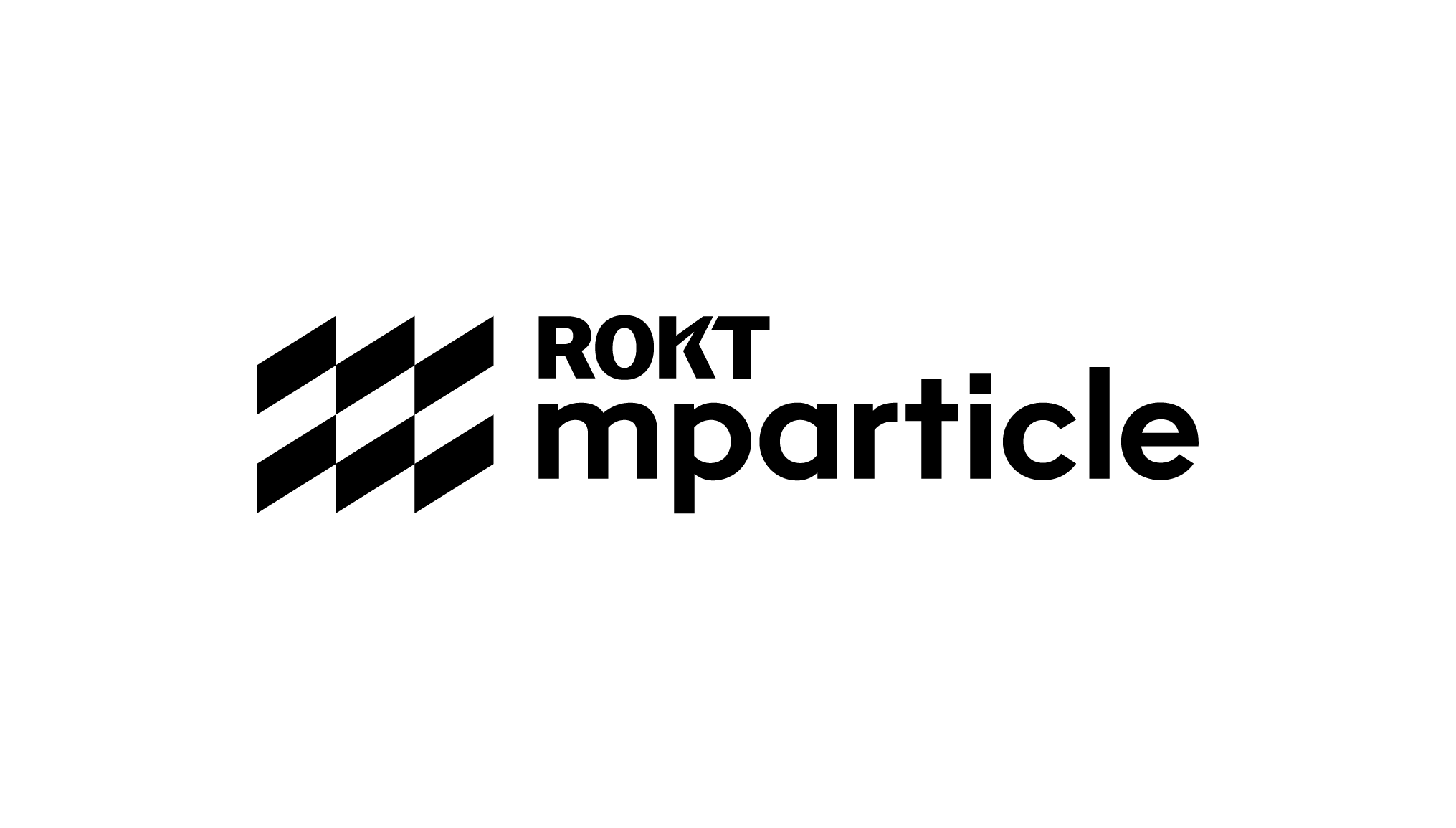
The mParticle logo is the primary identifier of the brand. It is employed to quickly communicate its name and identity at a glance–featuring the ‘by Rokt’ endorsement underneath and right-aligned.
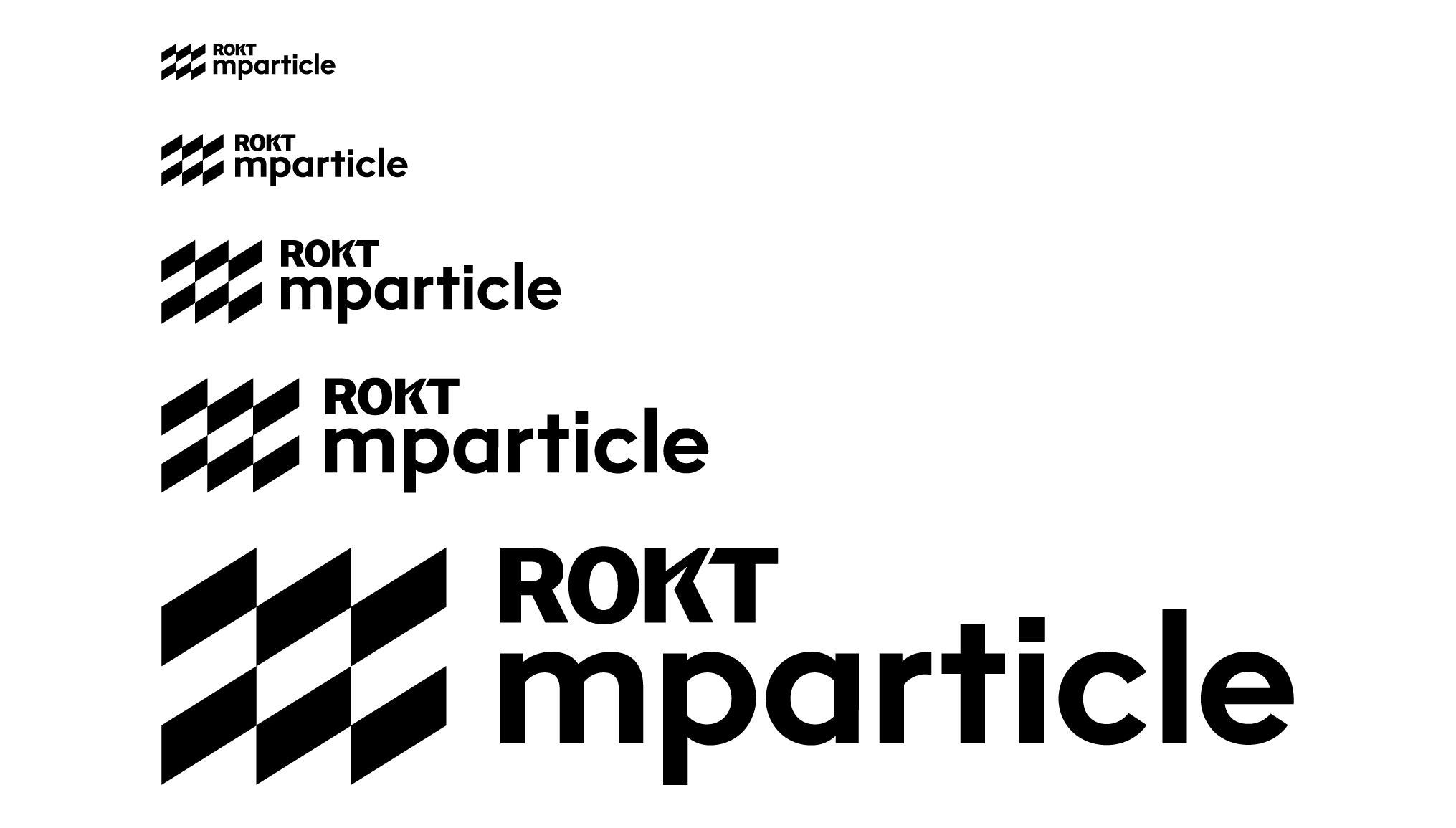
logo sizing
The logo has been carefully crafted to read well, even at small sizes. There is no limit at large scale, but be careful at smaller sizes. If legibility is an issue, it’s too small. Recommended minimum size is 20 pixels for screen, and 1/4 inches in print.
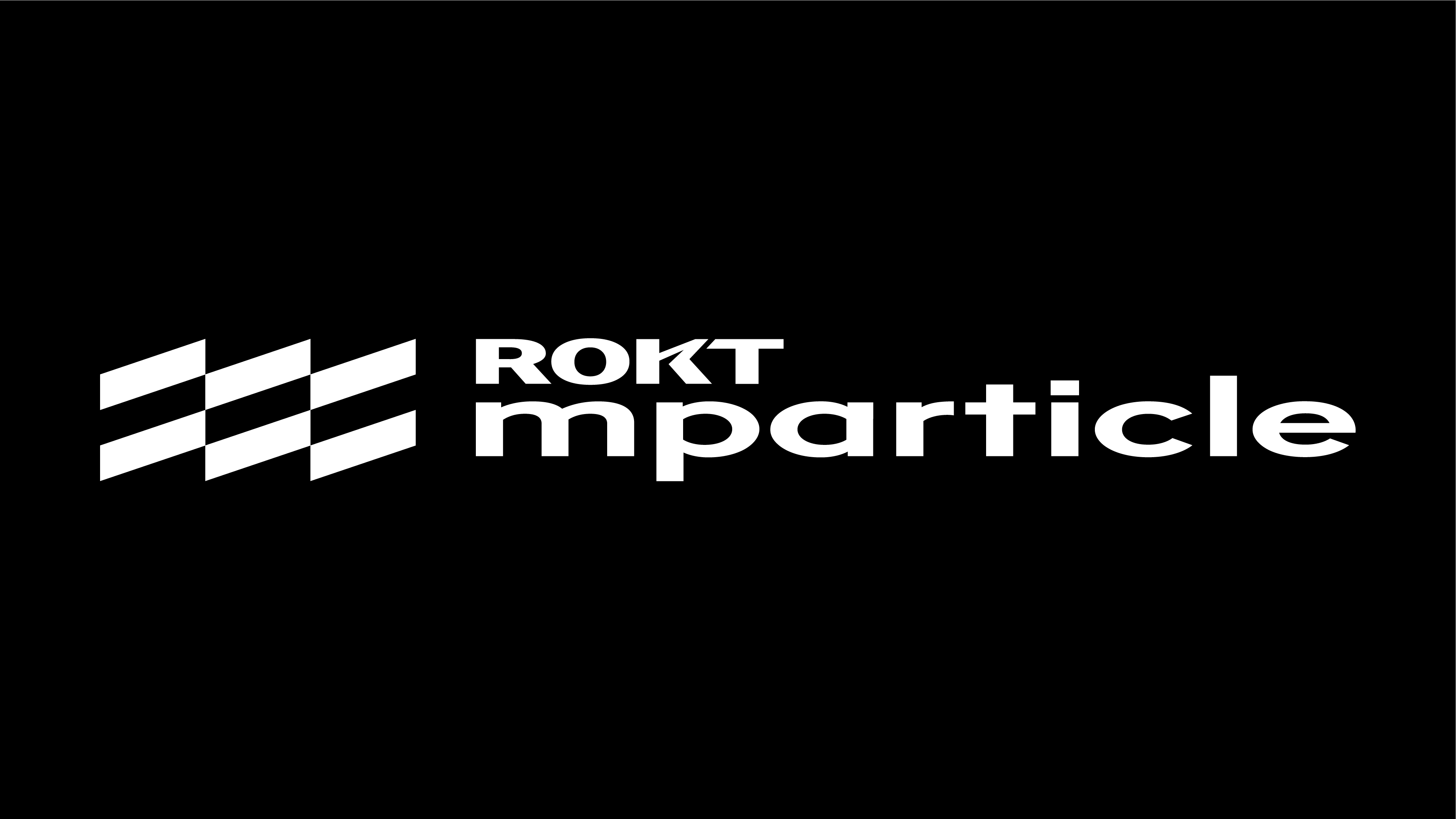
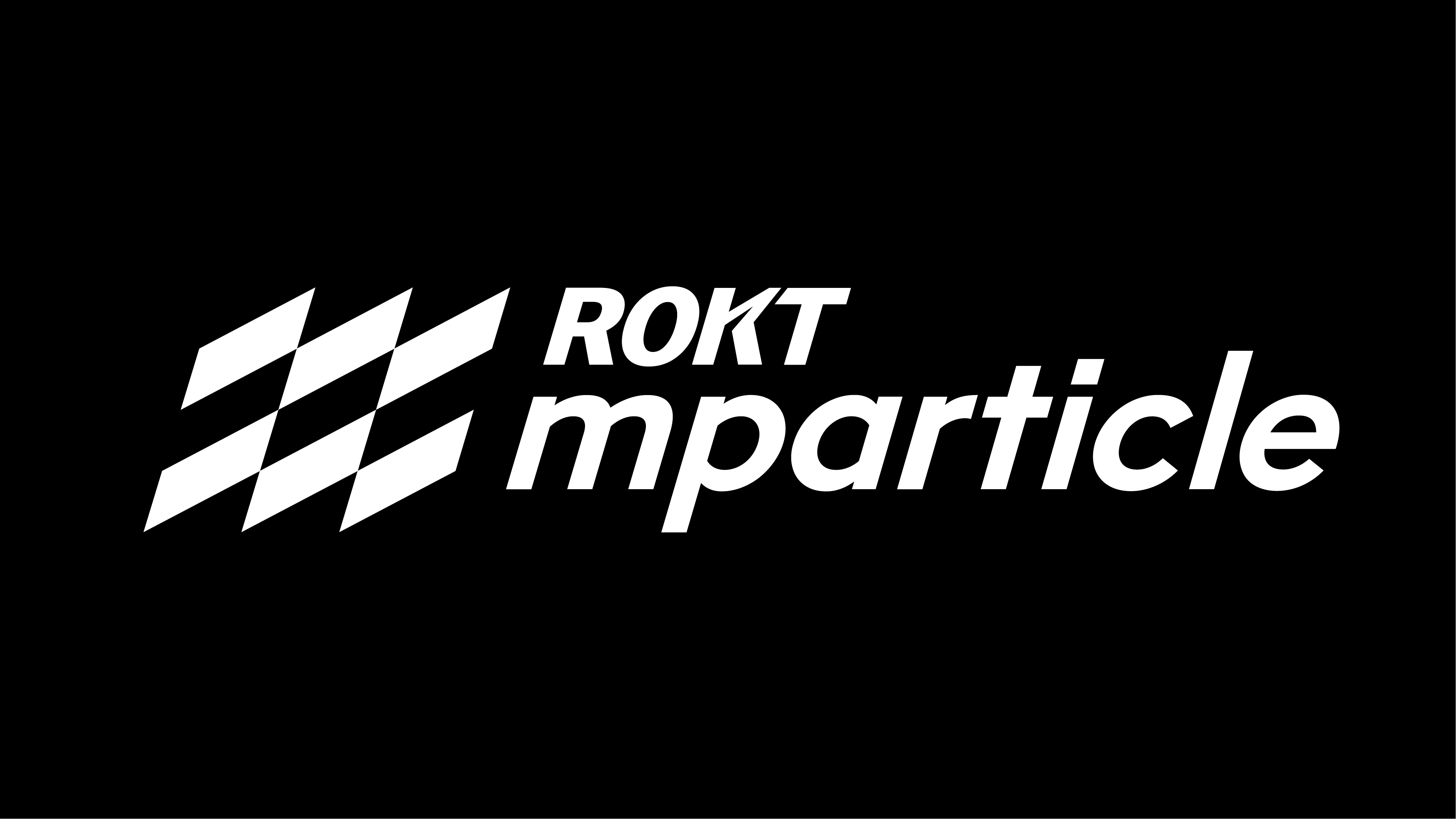
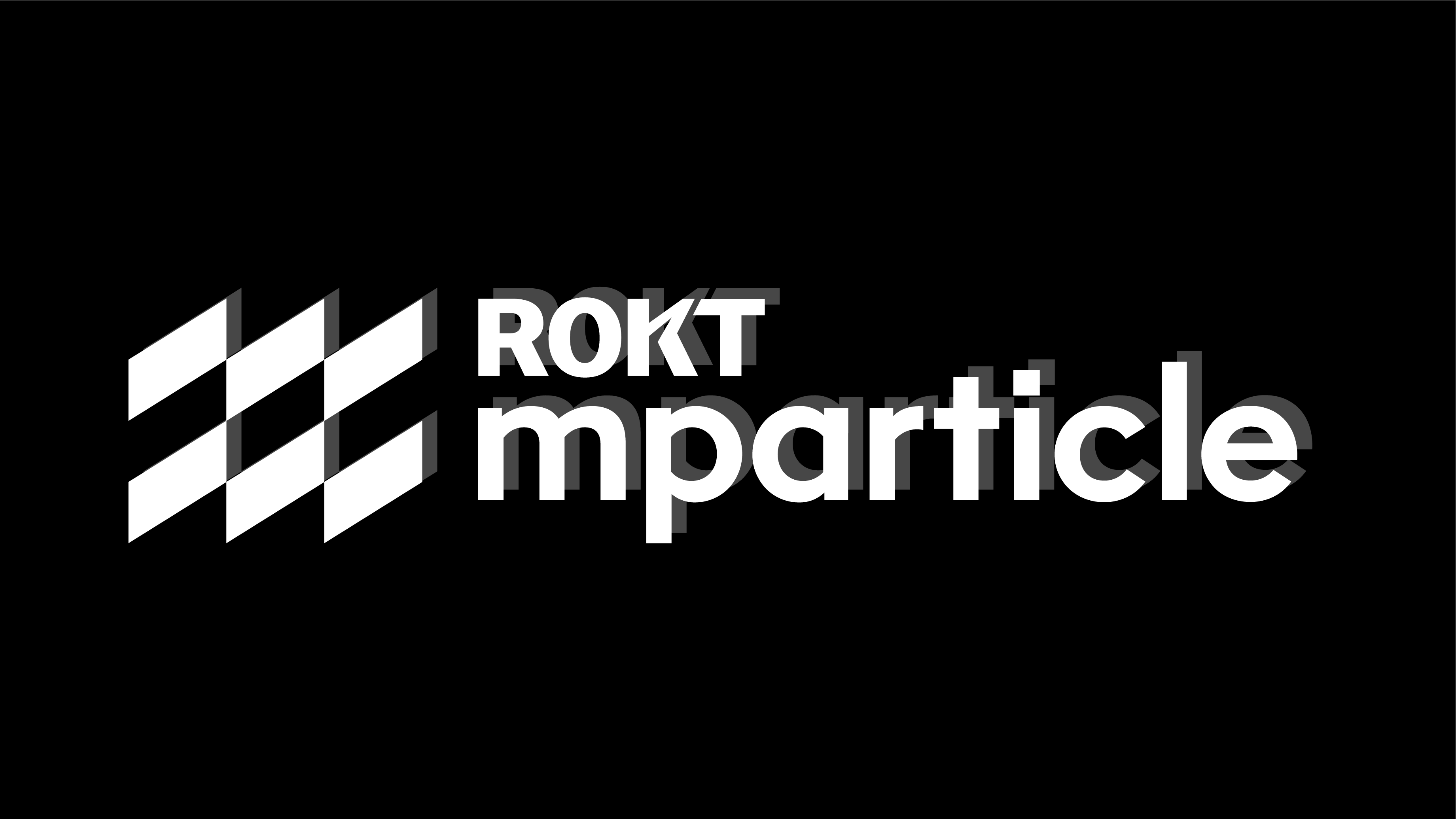
Watchout
We hate to point out the obvious but please don’t mask images inside the logo, nor change the typeface, use colors outside the primary palette, or stretch, distort, rotate or tilt the logo.
Don’t stretch
Don’t tilt
Don’t use unapproved colors
Don’t separate the logo
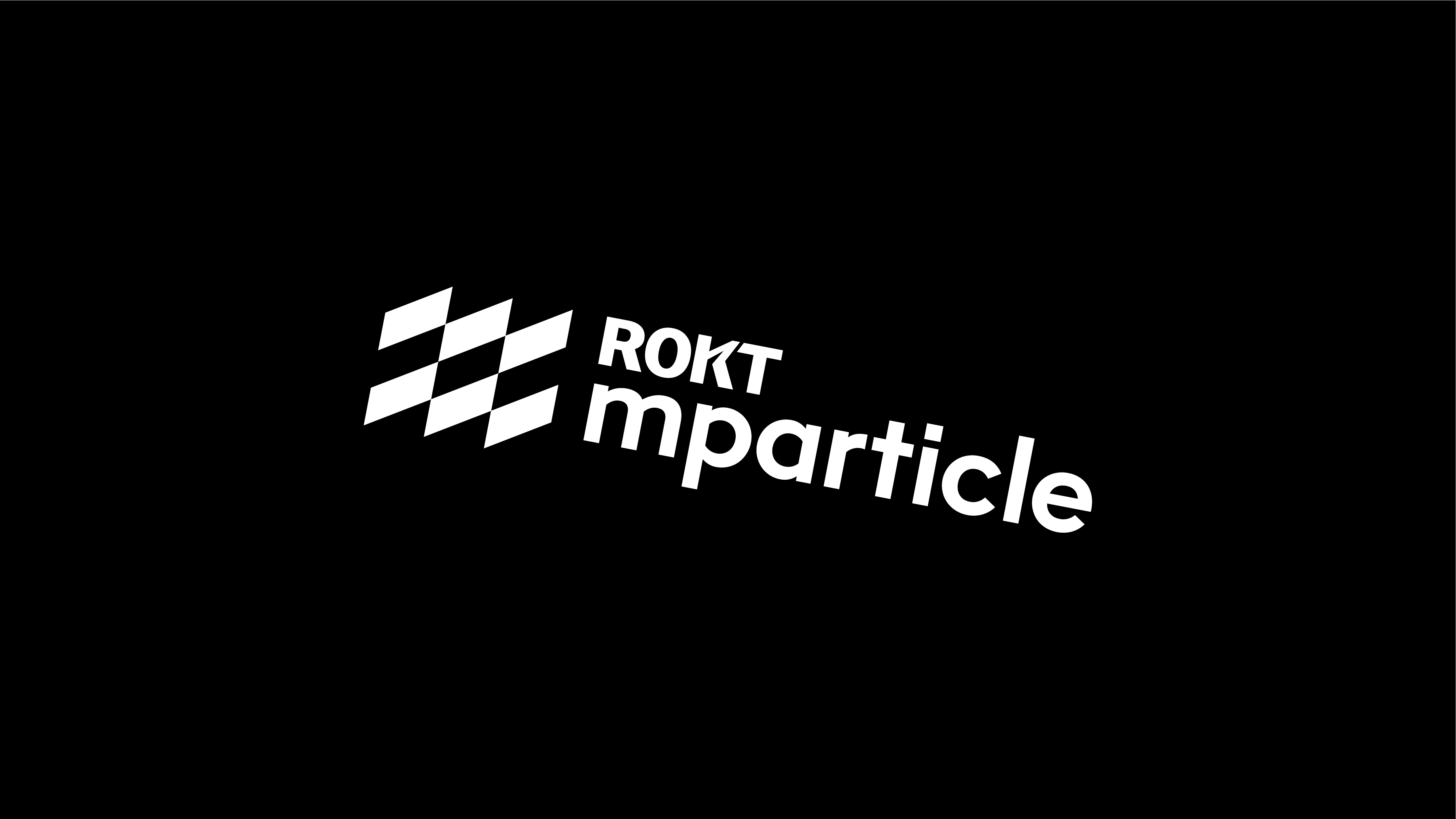
Don’t rotate
Don’t apply shadows or effects
Our purpose
Why we exist