Logo
Logo
Our logo captures the essence of our brand: bold and unique. It sits at the core of our brand and should be used on all of our communications.
on color
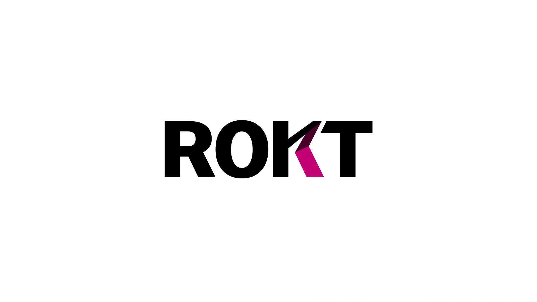
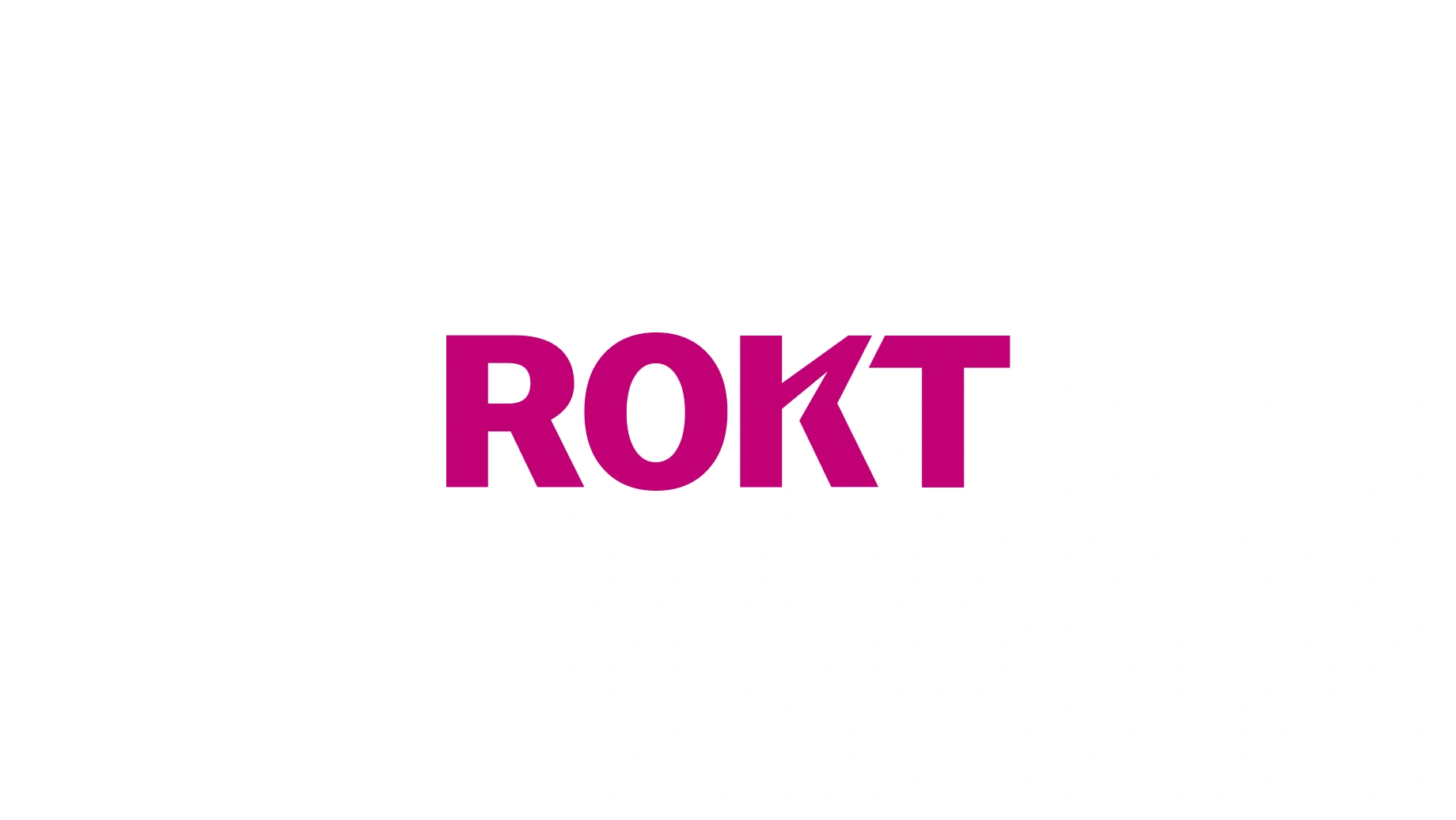
Please keep our logo monochromatic: black on white or white on black. The multicolor and Beetroot versions are reserved for visually busy environments, and the white logo for use over photography. All of which require prior approval.
clear space
To look our best, we all need space to stand out. So, please don’t overcrowd our logo. The parameters below keep a degree of clear space, whilst our minimum size ensures legibility.
partnership lockups
We like to keep good company. For hero moments, both brands are separated by our Connector with partner logos appearing first and ours second.
Using white or black logos are dependent on background colour or image.
watchouts
We hate to point out the obvious but please don’t mask images inside the logo, nor change the typeface, use colors outside the primary palette, or stretch, distort, rotate or tilt the logo. Oh, and never swap the “K” for a normal one.
Never mask images inside the logo or the “K”.
Never change the typeface of the logo.
Never use colors outside the primary palette.
Never swap the “K” for a normal “K”.
Never stretch or distort the logo.
Never rotate or tilt the logo.
Never use AI to stylize the logo