Applications

brand volume

In the Rokt world, relevance rules. This is as true for our brand as it is for our partners and their customers. We use a brand volume system to keep our communication consistent and clear.

It helps us to keep our messaging relevant across different platforms and diverse audiences with varying levels of knowledge. From functional, calm and reduced to expressive, playful and energetic or–as we like to think of it–Quiet, Mid, Loud.
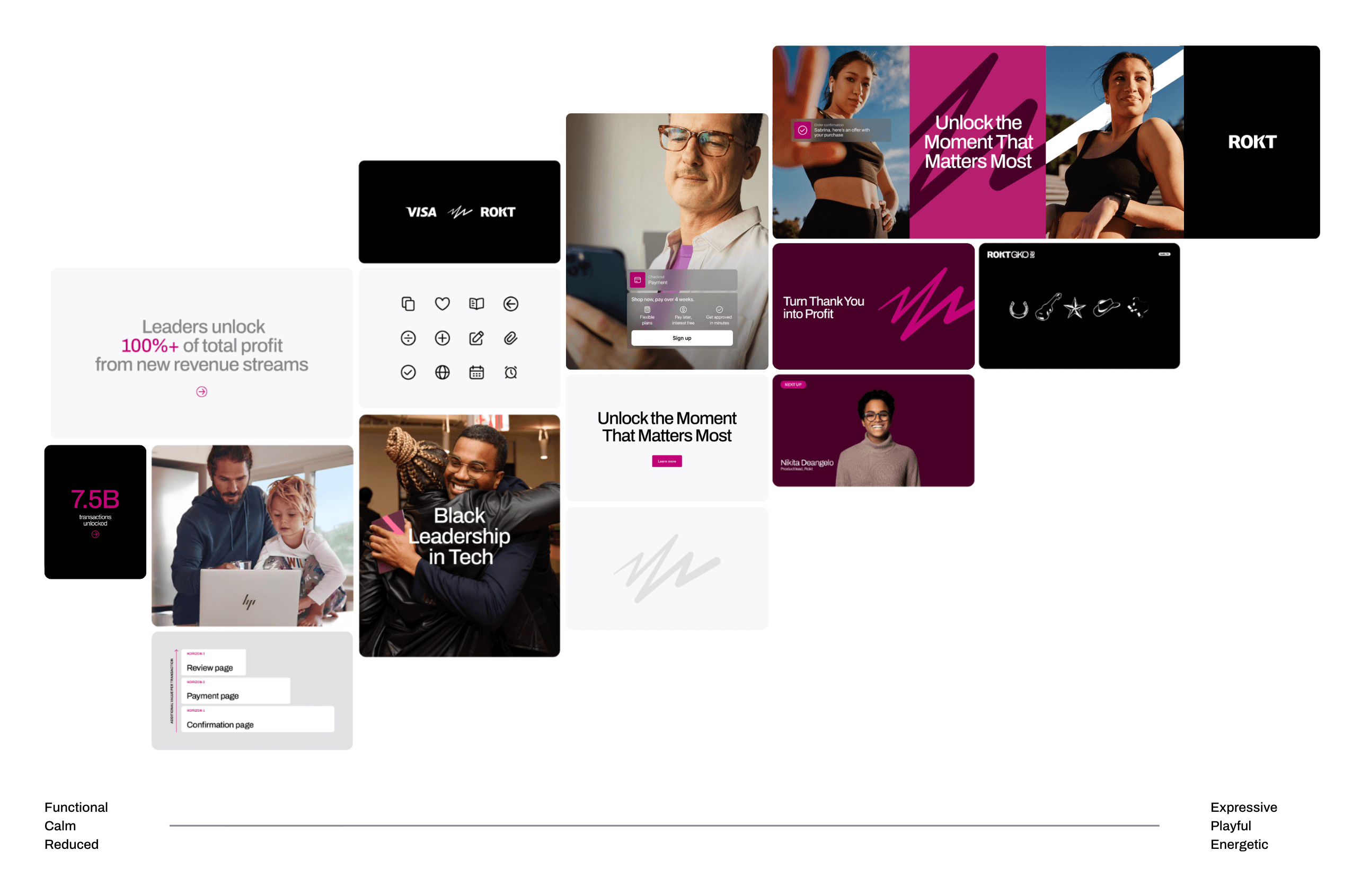
Collage of images and text blocks showing diverse people, payment interface, icons, and phrases like 'Unlock the Moment That Matters Most' and 'Black Leadership in Tech', highlighting themes of profit growth, leadership, and technology.

design examples

Putting it all together is easier than you think. But, to whet your appetite, we’ve included some design examples below.

Two people running outdoors near a metal railing by the water during sunset, with an online shopping overlay showing running shoes added to cart and recommended compression socks.
Abstract bold pink zigzag shape on a dark purple background.
Embossed black square logo featuring Oracle Red Bull Racing, ROKT, and Team Partner text on a dark background.
Woman with curly hair looking at her phone, overlaid with a notification offering a special cash back credit offer with apply and no thanks buttons.
Billboard featuring two images of a woman in workout attire with text 'Unlock the Moment That Matters Most' and the ROKT logo on a black background.
Person holding a smartphone showing ROKT website with a headline about unlocking moments that matter most and options to talk to an expert or explore the demo.
Magenta text showing 7.5B transactions unlocked on a black background with a magenta arrow below.

Motion